How to kern type in Photoshop
Easy steps to kern type in Photoshop
Here in the southwestern desert at Desert Life Design, we use graphic design, photography, and creative writing to create a compelling call-to-action.
How to kern headlines and text in Photoshop
by Doug Martin
Desert Life Design™
With Adobe's Photoshop, it's easy to kern type. Kerning makes the letters in words fit together more cohesively. That enhanced connectivity makes words faster and easier to read, especially with larger point sizes. But, what exactly is kerning?
What is kerning?
Kerning is removing (or adding) white space between pairs of letters. With Photoshop, you can kern pairs of letters manually, or use the different automatic settings.
In Photoshop, the kerning option is on the Character panel (Window > Character). The tracking option is also available on the Character panel, but tracking removes a consistent amount of white space between all the letters.

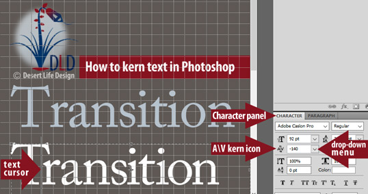
To kern in Photoshop, open the Characters panel (Window > Character). Go to the A\V icon (just below the point size selector). From there, hover over the icon and move your mouse left or right. Or, select the numbers from the dropdown menu.
In the photo above, we also removed extra white space between the letters 'i' and 't', along with the letter pairs 'i' and 'o'. To make the word look more visually appealing, we continued by kerning the 'o' and 'n' letter pair.
At Desert Life Design, we always kern our type, especially when we're using specific pairs of letters in large point sizes.
When should you use kerning?
Specific pairs of letters need kerning
Specific pairs of letters should always be kerned, especially when you use larger point sizes. Examples of letter pairs that should be kerned include: Tr (see the examples below), Wa, Yo, Pe, WA, along with countless other letter combinations.
Larger point sizes require more kerning
Headlines or other text in larger point sizes will need kerning.
With larger point sizes, the extra gaps of white space between pairs of letters becomes more obvious. That's why headlines should be kerned.
In fact, larger sizes of type might require both kerning and tracking to make your text easier to read at a glance.
What happens when you kern?
Removes extra white space between two letters
When you kern specific letter pairs like the 'Tr' combination, you remove (or add) white space between the capital T and the lower-case r. Essentially, you will tuck the letter 'r' under the top of the upper right arm of the capital letter 'T'.
To do that tucking, you remove the extra white space separating the 'T' and the 'r'. Once the tucking or kerning is finished, your word will look cohesive so readers can quickly scan your text and get the message.
How to kern type in Photoshop
- On Photoshop's menu bar, select Window, then scroll down and select Character (Window > Character).
- Select the text tool, and click to place your text cursor between the two letters you'd like to kern.
- On the Character panel, hover your mouse over the A\V icon on the left, just below the point size selector.
- Click your mouse, and move it slowly to the left to remove white space (to add white space, move your mouse to the right). Or, just to the right of the A\V icon, select the drop-down menu. There, you'll see negative or positive numbers. Select a negative number to reduce the white space. To fine-tune the white space, click in the box and type your own number.
Another easy way to kern character pairs in Photoshop
- With your text tool, click to place your text cursor between the pair of letters where you'd like to remove extra white space.
- With a PC, press and hold the Alt key while you click the left arrow key to remove white space. Use the right arrow key to add white space. If you're using a MAC, press-and-hold the Option key in place of the Alt key.
Automatic kerning with Metrics and Optical settings
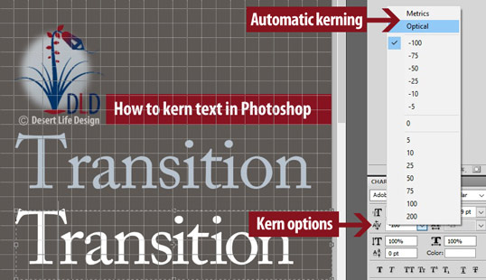
In Photoshop (along with Adobe's InDesign and Illustrator), there's also a Metrics or Optical kerning option. Both settings will kern specific letter pairs automatically.
To access the Metrics or Optical settings, go to the Character panel and the A\V icon. Use the same drop-down menu you used to make manual adjustments described above. Above the predetermined numbers, you'll see the Metrics or Optical options.
Metrics
I usually use the Metrics setting in Photoshop. The Metrics setting uses information supplied by the type designers to make specific letter pairs look best.
Personally, I always use the Metrics setting in Photoshop, unless I'm manually adjusting the white space. However, with larger point sizes, I believe the Optical setting gives me the best results.
Optical
Optical kerning automatically adjusts the white space between specific letter pairs based on their shape. That's really a nice feature when using serif type, for instance.
The optical kerning setting will automatically tuck the serif from one letter over the serif from another letter. The lower-case letter 'a' adjacent to the lower-case letter 'p' is one example.

To access automatic kerning options in Photoshop, open the Characters panel (Window > Character). Then, click on the drop-down panel at the A\V icon. Select either Metrics or Optical.
Kerning your type makes it easier to read
Kerning is important, because it makes your text and headlines easier to read at a glance. Whenever I use larger point sizes for headlines, I always kern specific letter pairs manually.
Even though I'm not a professionally trained designer, the kerning options in Photoshop make my work look more professional and easier to read.

Desert Life Design™ is based in the Phoenix, Arizona metro area. Here, we strive for perfection in graphic design and concise written communications.
